Find your app's color
Answer six quick questions about your app, its audience, and the feeling you want people to have. We'll match you to a color family grounded in color psychology — a fixed set of rules, fully static, nothing sent anywhere.
Color psychology guide
Why color psychology matters in UX design
Before a single word on your screen is read, color has already made an impression. In UX and product design, color psychology is the practice of choosing hues that match the emotional response you want from your target audience — trust in a banking app, calm in a meditation app, urgency in a checkout flow. Picking a color palette isn't just a branding decision; it's a usability decision that shapes how confident, comfortable, or excited people feel while using your product.
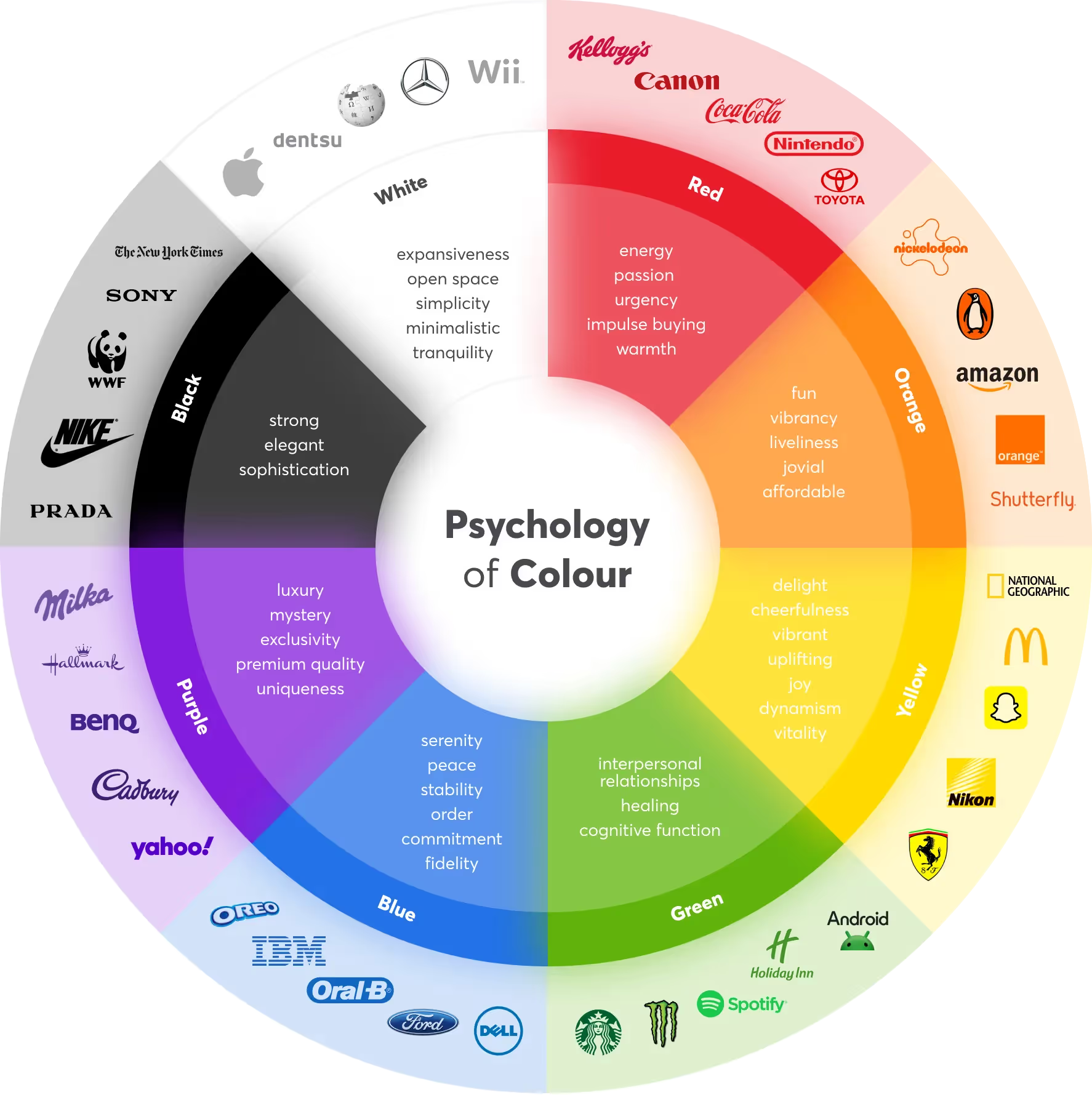
Most teams choose colors by instinct or trend, then wonder why the palette doesn't fit the brand. A more reliable approach starts with three questions: What industry is this for? Who is the target audience? What emotion should the product evoke? Those three answers, mapped against a color wheel like the one above, are usually enough to land on a defensible, on-brand palette.
How color affects user behavior
Every hue on the wheel carries a different psychological weight. Blue reads as secure and dependable, which is why it dominates fintech, healthcare, and enterprise software. Red and orange create a sense of urgency and energy, making them common choices for calls-to-action, sales, and fitness apps. Green signals safety, health, and growth, while purple leans into luxury, creativity, and imagination. Pink softens a product toward warmth and approachability, and yellow is the fastest route to optimism and fun.
None of these associations are universal laws — culture, context, and prior brand exposure all shape how a color reads — but they're a strong, well-documented starting point for a first color decision.
Color meaning cheat sheet
| Color | Hex | Core meanings |
|---|---|---|
| Blue | #3E7CB1 | Purpose, Confidence, Security, Trust, Power, Success |
| Purple | #8B4FC7 | Spirituality, Art, Mystery, Royalty, Fantasy, Imagination, Justice |
| Pink | #E85D9A | Calm, Gratitude, Respect, Femininity, Intuition, Creativity, Softness |
| Red | #D8483C | Love, Action, Energy, Adventure, Strength, Passion |
| Orange | #E27B33 | Original, Enthusiasm, Freedom, Pleasure, Emotion, Optimism, Youth |
| Yellow | #D8A22E | Clarity, Curiosity, Warmth, Joy, Positivity, Happiness, Fun |
| Green | #4E9367 | Loyalty, Harmony, Safety, Prosperity, Luck, Nature, Health |
Frequently asked questions
What is color psychology in UX design?
Color psychology looks at how hues influence emotion, trust, and behavior. In UX and product design, it's used to reinforce a brand's personality and nudge users toward specific actions, like tapping a call-to-action or feeling reassured during checkout.
Does color choice actually affect conversion rates?
Color alone rarely makes or breaks a conversion, but it shapes first impressions and can support or undercut clarity, contrast, and trust signals. A color that fits the audience and matches the intended emotion tends to perform better than an arbitrary brand color.
How do I choose a color palette for my app?
Start with your industry, audience, and the core emotion you want people to feel — trust, energy, calm, or playfulness are common starting points. From there, pick a dominant hue and build a small palette of 3–5 supporting shades around it.
What color builds trust the fastest?
Blue is the color most consistently associated with trust, security, and professionalism, which is why it dominates finance, healthcare, and enterprise software. Green is a close second for wellness and sustainability-focused products.
Should color choice differ by target age group?
Yes. Bright, saturated colors like yellow and orange tend to read as playful and work well for younger audiences, while muted blues, greens, and neutrals often feel more credible to older or professional audiences.
Is this color psychology tool free, and does it use AI?
Yes, it's free to use and fully static — there's no AI model involved. Every result comes from a fixed, inspectable scoring table that matches your answers to a color family on the wheel.